Platinum-grade portraits: Exploring Elizabeth II’s image on banknotes throughout her reign

Explore Elizabeth II’s image on banknotes throughout her reign
Published on 01 June 2022

Blog

Alice Beagley, Museum Officer 

On 6 February 2022, Queen Elizabeth II became the first British monarch to celebrate a Platinum Jubilee, marking 70 years on the throne. This June marks the 70th anniversary of her coronation, and we join the rest of the country and world celebrating her remarkable achievements as Queen.

You might be used to seeing the Queen’s portraits on banknotes, but did you know the Queen is the only British sovereign to have appeared on banknotes issued by the Bank of England?  

Let’s roll back the years and find out how it all began… 

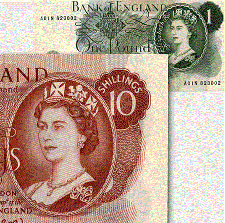
In 1956, the Treasury granted permission for a new series of banknotes to feature the Queen’s portrait. The first banknote including her portrait was the £1 note issued on 17 March 1960, followed by the ten shilling (10/-) note in 1961.

On both these banknotes the Queen is wearing the Diamond Diadem, a jewelled crown which she also wore on the way to her Coronation in June 1953. 

The Queen’s first portraits on a banknote, by Robert Austin

The original portrait was made by Bank of England note engraver, Robert Austin. In 1958, the design was finalised and sent to the Queen for approval. The Queen’s Private Secretary wrote to the Bank of England on her behalf, noting that whilst she was pleased with the likeness overall, ‘her one and only objection is that the drawing of her face does not show the line of her jaw at all. It remains almost a plain white area…if this line could be indicated in any way, she thinks that it would be an improvement’. Unfortunately the jawline could not be amended without the risk of ruining the portrait and went to the printers unchanged (sorry Ma’am!).

Unfortunately, this was not the end of criticisms of the portrait, as people thought that the Queen’s facial expression looked severe and unrealistic. Bank of England Governor L.K O’Brien also complained that ‘there was too much hair, reduction of which might make the image look younger; the chest was too full, giving the Queen a portly look; the left eye did not seem to be looking in the right direction; the elimination of the extreme fullness of the face in the first portrait had given the line of the chin a slightly pinched effect; and the mouth needed a little softening…’

Yikes!

Alan Reynolds Stone’s portrait of the Queen

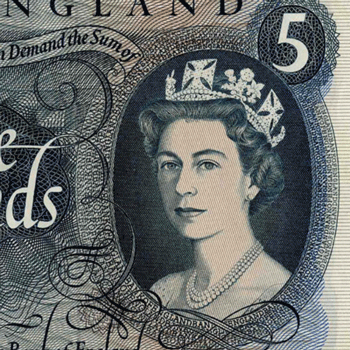
In 1963 a new £5 note was issued, followed by a new £10 note in 1964.  Alan Reynolds Stone designed the portrait for these notes, and it was well received as it was thought to be more realistic and the Queen's gaze appeared more relaxed. 

Interestingly, Stone specialised in woodcut engraving and lettering rather than banknote engraving, but he was still keen to take on the challenge. He wrote to the Bank of England saying that he was eager to learn how to work with the Bank’s geometric lathes. These were machines used to create intricate patterns on the notes to make them harder to copy. Some examples of the patterns can be seen on the Series C £5 note designed by Stone, pictured above. 

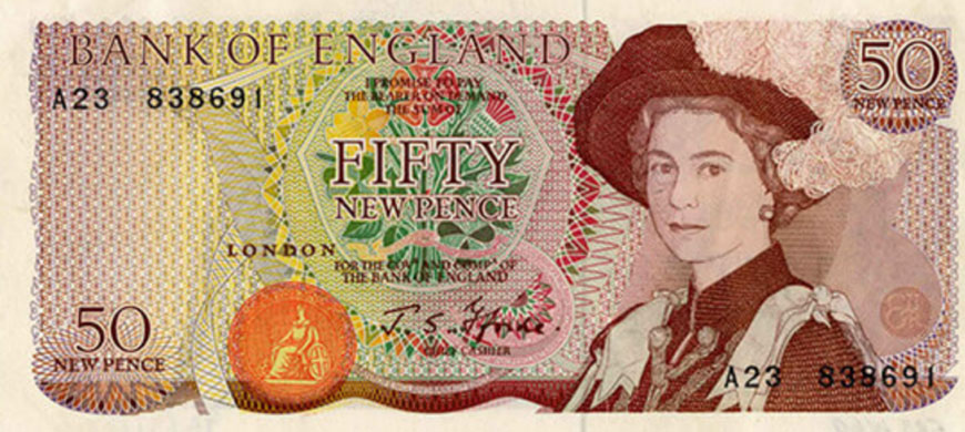
Harry Eccleston’s portrait of the Queen for the 50p note

By the late 1960s the Bank was preparing for decimalisation which occurred on 15 February 1971. New banknotes were needed, and so, therefore, was a new portrait of the Queen. The proposed 50p note, pictured above, was designed by Harry Eccleston and shows the Queen wearing the hat and robes of the Order of the Garter. This time, the Queen’s portrait is not in a frame and takes up more space on the note, making her portrait a much more prominent feature.

The banknote was never issued, however, as a 50p coin was created instead, which is a shame as the design looks fabulous! 

Further portraits of the Queen by Harry Eccleston
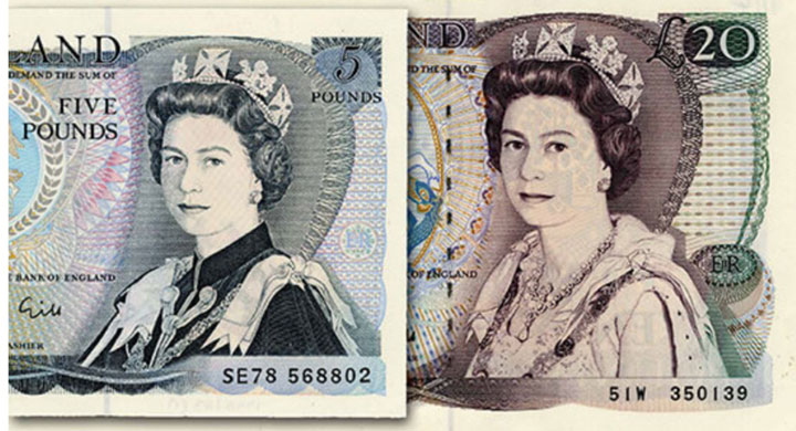
In the early 1970s, Eccleston launched two new portraits of the Queen: one for the £1 and £5 notes, and another for the 'high sum' notes of £10, £20 and £50. On these notes, the Queen is wearing elaborate ceremonial dress to create a sense of formality and tradition.
Roger Withington’s portrait of the Queen

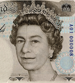
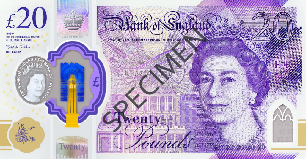
The most recent portrait of the Queen was designed by Roger Withington for our banknotes in 1990. Unlike previous portraits, it only shows her face and neck, and first appeared on the £5 note.

Unfortunately the initial reception was frosty. The newspaper Today claimed that the Bank had portrayed the Queen as ‘an ageing Gran with a bulbous nose and a double chin,’ and The Times ran the headline: ‘God could not save our Queen from the designer’.

Over time, however, it became regarded as a ‘timeless’ image of the Queen. 

On our current polymer banknotes, the Queen's portrait also forms an important part of our new notes' security features: there is a second portrait in the ‘see through window’, which makes the notes even more difficult to copy.

£20 polymer note featuring Roger Withington’s portrait of the Queen

The Queen's portraits on our notes (and how they have changed over time) are a reminder of how long the Queen has served the people of the UK and the Commonwealth.

We would like to thank our designers, printers and everyone involved in the production of banknotes for providing such wonderful designs over the decades. And, of course, we would like to congratulate Her Majesty on her Platinum Jubilee!